Friday, October 30, 2009

Sign Design


Here is a hanging double sided sign for Moyaboya in Creemore.
The sign was designed to be almost completely fabricated using a CNC Router.
The design elements sculpts light and shadow with varied layers of projected mount shapes adding interest and dimension without distracting from the logo . The white on white background colour supplies a buffer and adds a subtle, light, fresh, warm glow to the overall image.

Wednesday, October 28, 2009

Happy Halloween!


Teddy Bears Daycare made their way down Main Street this morning Trick-or-Treating as Lions, Peacocks and Super Heros, getting the jump on some Halloween sugar intake.
They excitedly called out "Happy Halloween" some with just the abbreviated version.
So endearing ...too bad they grow and become teenagers

Tuesday, October 27, 2009

Running at night


I purchased some night running gear (head light and Reflective vest) recently and went out for my first night run. It took the joy of the activity to another level. The experience of running on winding country roads flanked by still dark forests under light of moon on a crisp fall evening was pure escapism. It was another world.
I used to think running was for only for the select few, after an experience like this I think we were designed for it.

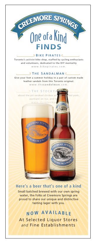
Creemore Springs Calgary ad


Before


[calgary.jpg]
After

A refurbished ad initially created by Molson's creative. I was hired to make the ad more engaging and align with the brewery's brand.

Thursday, October 22, 2009

Moyaboya

Moyaboya is Croatian for "my colour".

It's a new distinctive decor retail store in Creemore that will feature classic pieces with a european funk. A fresh approach to interior design with an eclectic play of shapes and finishes that embrace colour.


Halloween at the Bank

Saturday, October 17, 2009

Playground Donor Plaque


A design for the new Creemore playground to honor the donations that helped make it possible.
The criteria was for a simple design that wasn't too costly or obtrusive. A design that was light and playful.
The lines, shapes and colours reflect the organic form of the slide and surrounding trees. The colours were borrowed from the bark and the contrasting colours of the playground equipment. The flowing lines and circles could be interpreted as balloons and the overall shape as an expecting mom.
It was an effortless piece - a good creative litmus test.

The principal shape was laser cut by Prototier and the laser etched stainless steel plaque by Laserwerks with metal fabrication by Iron Butterfly.

It was one of the last pieces assembled in my studio

Friday, October 9, 2009

A partnership


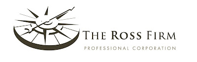
This logo revision to the initial design was a result from a nudge from the client. The main element which was explained in the previous post was well received by the client, however wanted the compass to be filled out in it's entirety.

This request pushed the design into a better place and created a more comprehensive image to represent their firm.

Tuesday, October 6, 2009

Pint Night


An in pub promo poster for creemore springs beer, created in Illustrator.

Creemore Springs goes to Oktoberest


A design for promoting Creemore Springs Brewery Bottled product at Kitcheners Oktoberfest.
A clean take on a traditional beer for a traditional event.